
To create a cohesive color palette throughout your home, start by identifying colors that reflect your personality. Look for inspiration in magazines or online, and make a mood board to visualize your ideas. Think about how light changes colors and choose shades that fit your space. Use neutral tones as a base, then add a few accent colors in decor and furniture. It’s like creating a beautiful song! Excited to explore more ways to harmonize your home?
Key Takeaways
- Start with a neutral base color to establish a cohesive foundation across connected spaces in your home.
- Choose two or three accent colors that resonate with your personal style for decor items throughout the home.
- Evaluate natural light in each room; adjust color choices to ensure harmony and balance in different lighting conditions.
- Create a mood board to visualize themes and ensure consistency in colors and design elements across various spaces.
- Trust your instincts and embrace personal expression; let your unique style guide your color selections for a harmonious feel.
Why a Cohesive Color Palette Matters for Your Home
A colorful home isn’t just about paint on the walls; it’s about creating a feeling that welcomes you every time you walk through the door. A cohesive color palette makes your space feel harmonious and balanced. When colors flow together, they tell a story, inviting warmth and comfort. Imagine stepping into a room where each hue compliments the next; it’s like a warm hug!
Plus, a unified look can help your home feel larger and more organized, rather than chaotic. You’ll find it easier to mix and match furniture and decor, too. So, embrace the joy of color! With a little thought and creativity, you can transform your home into a vibrant sanctuary that reflects your personality and makes you smile every day.
Identifying Your Personal Style and Preferences
Finding your personal style is like discovering a treasure chest of colors, patterns, and textures that truly speak to you. It’s exciting to explore what makes your heart skip a beat! Here are three fun ways to identify your unique style:
- Explore Inspiration: Look through magazines, Pinterest, or Instagram. Save the images that catch your eye—this helps you spot common themes!
- Think About Your Favorites: Consider your favorite colors, fabrics, and even places. Do you love the calm of blues or the energy of reds?
- Create a Mood Board: Gather your favorite images, colors, and textures into a collage. This visual will guide you in creating a cohesive palette that feels like home!
Dive in, and enjoy the journey!
Assessing Your Space: Key Factors for Color Selection
Evaluating your space is like being a detective in your own home, uncovering clues that lead to the perfect color palette. Start by considering the size of each room; lighter colors can make small spaces feel bigger, while bold hues can create cozy nooks. Next, take note of natural light—rooms flooded with sunlight can handle deeper shades, while darker areas might benefit from brighter, cheerful tones. Don’t forget about existing furniture or decor! They can be your best friends in color selection. Finally, think about how you want to feel in each room. Do you want calm and serene, or vibrant and energetic? Trust your instincts, and remember, there’s no wrong choice—just your unique style shining through!
Color Theory Basics: What You Need to Know
Understanding color theory can feel like revealing a secret code to transform your home into a cozy haven. It’s all about how colors interact and make you feel. Here’s what you need to know:
- Warm vs. Cool Colors: Warm colors like reds and yellows energize a space, while cool colors like blues and greens create calm. Choose based on the vibe you want!
- Color Saturation: Bright, saturated colors pop and grab attention, while muted tones offer a more subtle, relaxing atmosphere. Balance is key!
- Color Harmony: Colors that work well together create a pleasing look. Think of it like picking the perfect outfit; you want everything to match without clashing.
With these basics, you’re ready to create your dream palette!
Color Palette Options: Monochromatic, Analogous, or Complementary?
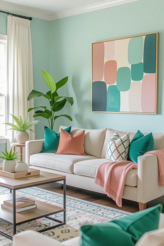
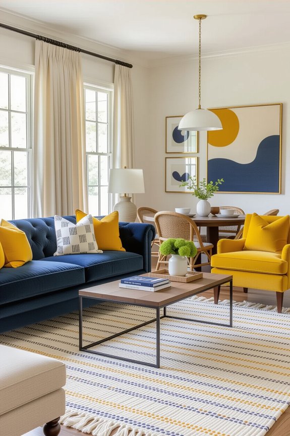
When you start thinking about your home’s color palette, it’s like opening a treasure chest filled with possibilities! You can choose a monochromatic scheme for a soothing vibe, sticking to one color in various shades. It’s like a favorite ice cream flavor—deliciously simple! Or, consider an analogous palette, featuring colors next to each other on the color wheel. This option creates harmony, like a cozy hug from your favorite blanket. Finally, there’s the complementary palette, which pairs opposite colors for a vibrant punch. Think of it as the perfect duet, where opposites truly attract! Each option can transform your space, so pick what makes your heart sing and get ready to create a home that reflects you!
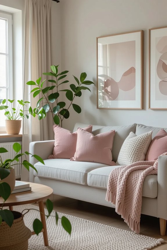
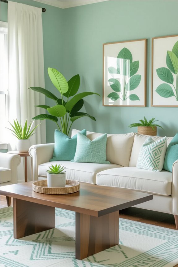
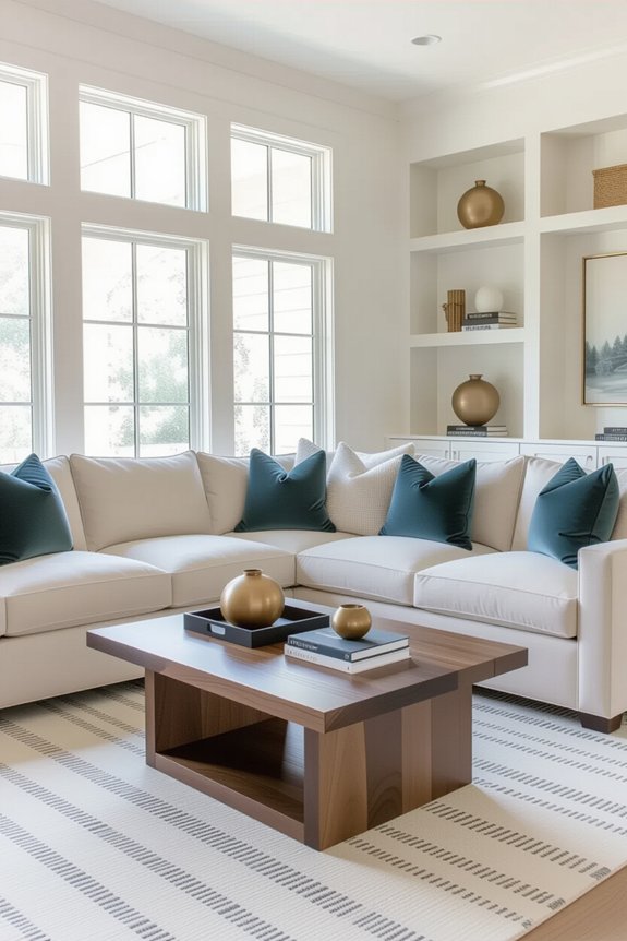
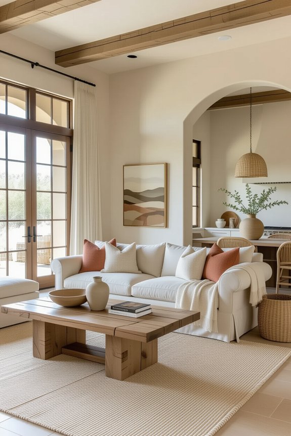
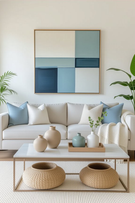
The Essential Role of Neutrals in Your Palette
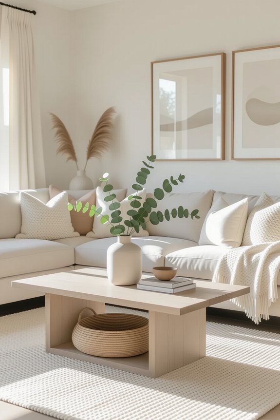
Neutrals are like the unsung heroes of your color palette, quietly holding everything together. They create a balanced backdrop, allowing your favorite colors to shine. Here’s why you should embrace them:
- Versatility: Neutrals work with any color. Whether you love bold shades or soft pastels, they’ll complement your choices beautifully.
- Calming Effect: They bring a sense of peace to your space, making it feel cozy and inviting. Imagine curling up with a book in a soft beige room.
- Timelessness: Trends come and go, but neutrals never fade. They keep your home looking fresh and stylish for years to come.
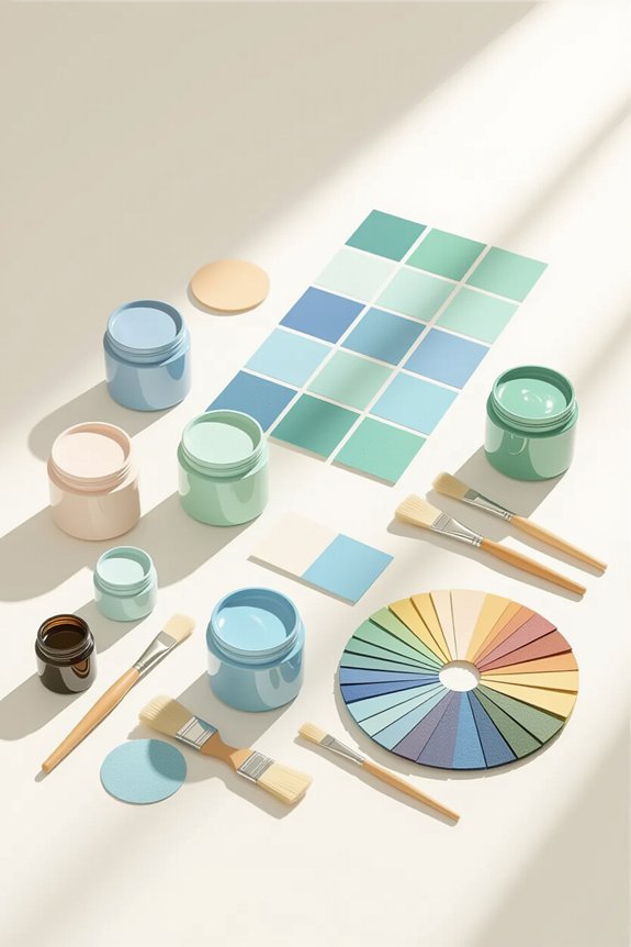
Creating a Color Mood Board for Inspiration
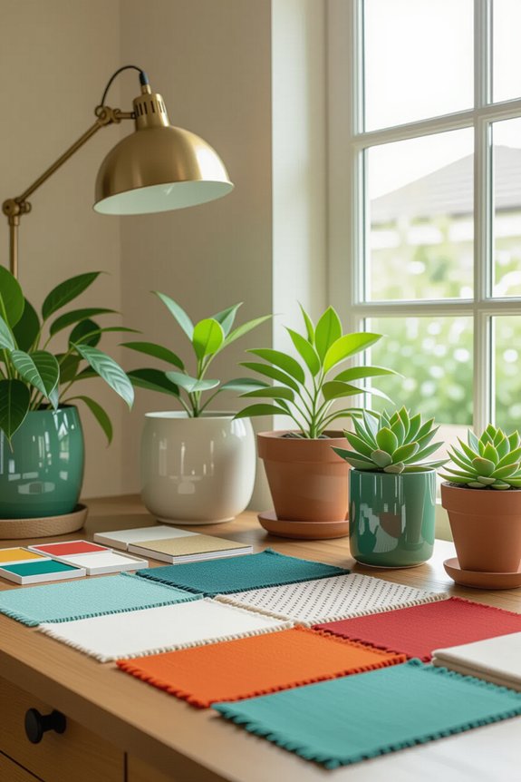
Creating a color mood board can be one of the most fun and inspiring parts of decorating your home. You get to express your creativity and explore colors that make your heart sing. Start by gathering paint swatches, fabric samples, or even photos from magazines. Lay everything out on a large board or a digital platform. Don’t be afraid to mix and match! You might find that a bright blue pairs beautifully with a soft gray. As you arrange your pieces, ask yourself how they make you feel. Excited? Calm? Happy? This board is your personal vision, so let it reflect your unique style. Remember, it should spark joy every time you look at it! Enjoy the process!
Selecting Your Home’s Dominant Color
Choosing your home’s dominant color is like picking the star of your very own show—it sets the tone for everything else! This color will influence your mood and the overall vibe of your space. To make your selection easier, consider these three tips:
- Think About Your Lifestyle: Do you want a calm sanctuary or a lively gathering space? Your choice should reflect how you live.
- Look at Natural Light: Different colors change in various lighting. Test samples in different rooms to see how they feel throughout the day.
- Trust Your Instincts: Pick a color that truly resonates with you. If it makes you smile, it’s probably the right choice!
Embrace this fun journey of color discovery!
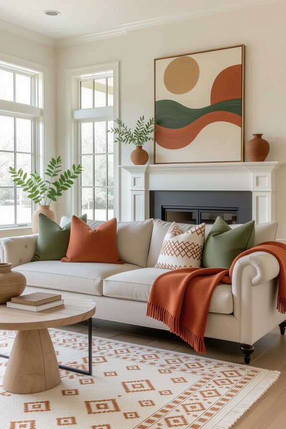
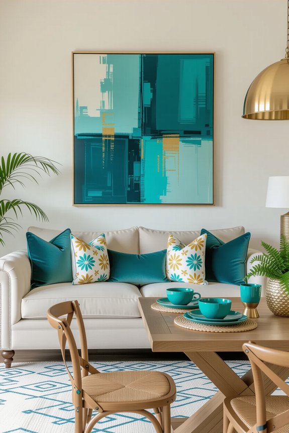
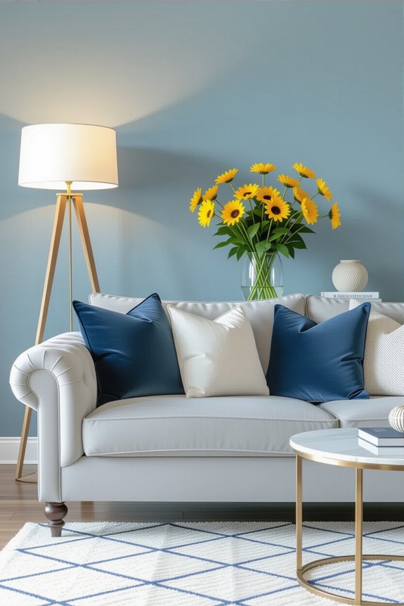
Choosing Accent Colors That Balance Your Main Color
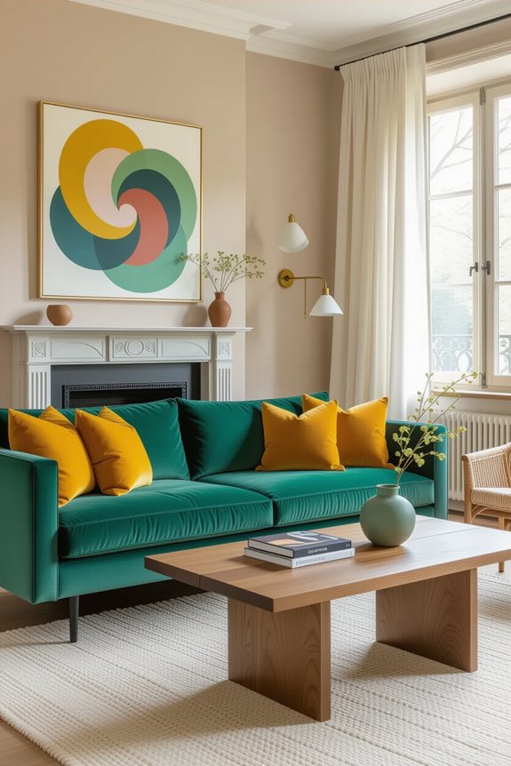
While your dominant color shines as the star, accent colors play the supporting roles that bring balance and harmony to your space. Think of them as the backup singers in a catchy song! When selecting these colors, consider shades that complement or contrast your main hue. For instance, if your dominant color is a soft blue, lively yellows or warm corals can create a stunning visual dance. Try to pick two or three accents to keep things cohesive—too many can feel like a chaotic concert! Remember, you’re aiming for a cozy vibe, so choose colors that make you smile. With the right accents in place, your home will feel welcoming, joyful, and truly you!
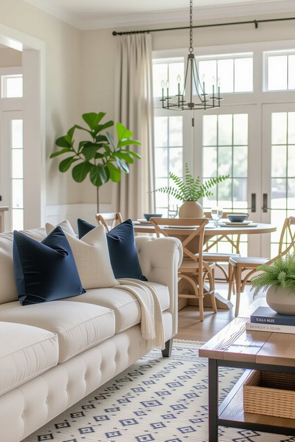
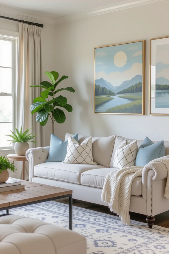
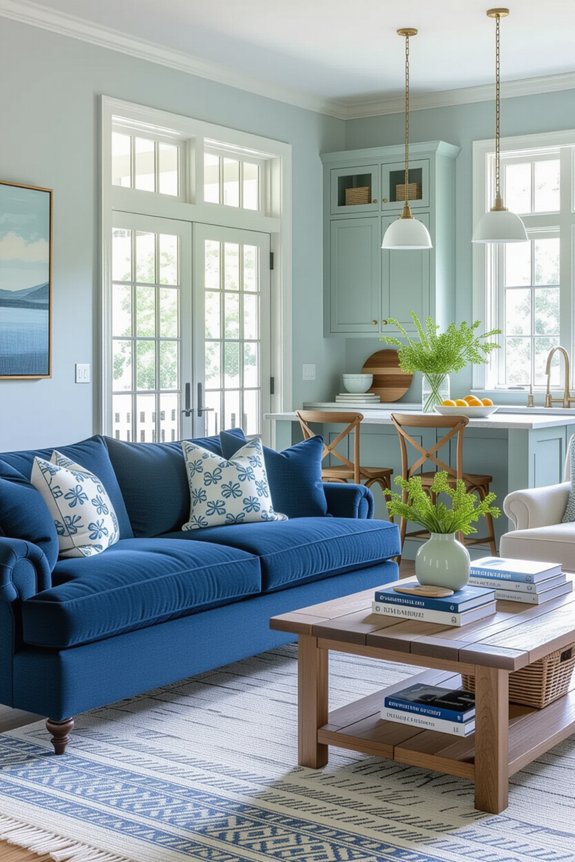
Balancing Warm and Cool Tones in Your Design
When you mix warm and cool tones in your design, it’s like crafting a delicious recipe—each ingredient plays a vital role! Balancing these tones can create a harmonious space that feels just right. Here’s how to do it:
- Choose a Dominant Tone: Decide whether you want your room to feel cozy and inviting with warm tones or calm and invigorating with cool ones.
- Add Accents: Sprinkle in the opposite tone as accents. A warm-colored lamp can brighten up a cool-toned room beautifully, just like a pinch of salt enhances flavor!
- Layer Textures: Use textures to balance tones. A soft, warm throw on a cool-colored couch can create a cozy vibe.
Mixing these tones can turn your home into a delightful retreat!
Using Color to Define Spaces
Color has a magical way of defining spaces in your home, almost like drawing invisible lines that guide you from one area to another. By using different hues, you can create cozy nooks or vibrant gathering spots. For instance, painting a reading corner in soft blues makes it feel inviting and calm, while a bright yellow dining area can spark joy and energy. You can also use color to separate zones; warm tones can make a living room feel snug, whereas cooler shades can open up a hallway. Remember, it’s all about balance! So, pick colors that resonate with you and reflect your personality. After all, your home should feel like a warm hug, not a confusing maze!
Integrating Color in Open Floor Plans
Creating a beautiful flow in an open floor plan can feel like a fun puzzle, especially when it comes to integrating color! You want each space to feel connected, so here are three tips to help you blend colors beautifully:
- Choose a Base Color: Start with a neutral base that’ll ground your spaces. Think soft grays or warm beiges—these colors can be your trusty sidekicks!
- Add Accent Colors: Pick two or three accent colors to sprinkle throughout. You can use them in throw pillows, artwork, or even a bold chair!
- Create Visual Pathways: Use rugs or furniture arrangements to link areas. This’ll guide the eye and make your home feel like a cozy retreat.
With a little planning, you’ll have a stunning flow that everyone will admire!
How Lighting Can Change Your Color Choices?
Have you ever noticed how a room can feel completely different depending on the light? It’s true! Natural light can make colors appear bright and fresh, while warm bulbs can create a cozy, inviting atmosphere. When choosing your color palette, think about how your lighting will influence your choices. For instance, a soft yellow may look cheerful in daylight but could feel too dull under artificial light.
Try testing paint samples in different rooms and at various times of day. You might discover that a hue you loved becomes too intense or too muted in certain lighting. Don’t be afraid to play around! Embrace the magic of light to enhance your home’s colors and create the perfect vibe.
Choosing Colors for Different Room Functions
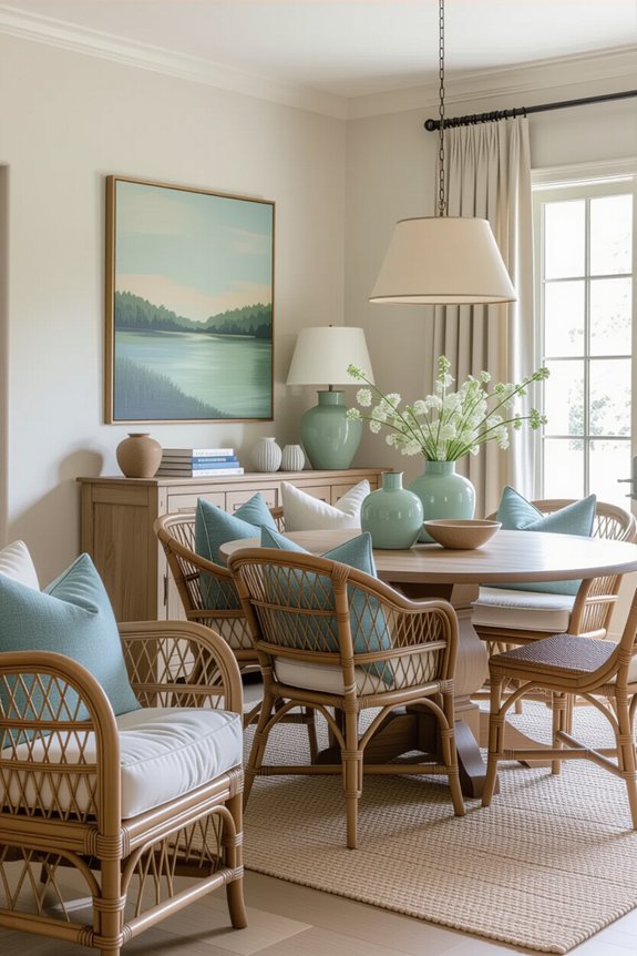
When you think about how each room in your home serves a unique purpose, it’s easier to choose colors that fit those functions perfectly. Let’s break it down:
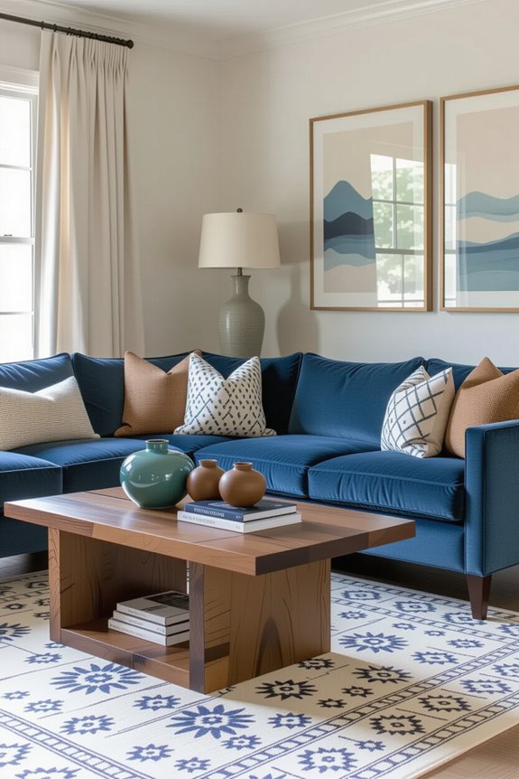
- Living Room: Go for warm, inviting tones like soft yellows or light earth tones. You want it to feel cozy, right?
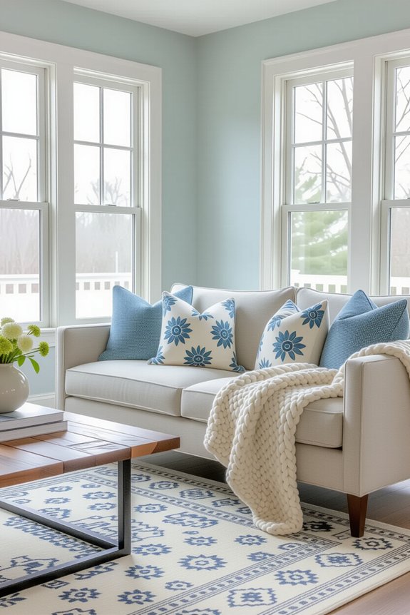
- Bedroom: Choose calming colors like gentle blues or muted greens. These shades help you unwind after a long day, making it your personal sanctuary.
- Kitchen: Bright whites or cheerful yellows can spark creativity and energy, perfect for whipping up those delicious meals.
Creating a Seamless Flow Between Indoor and Outdoor Spaces
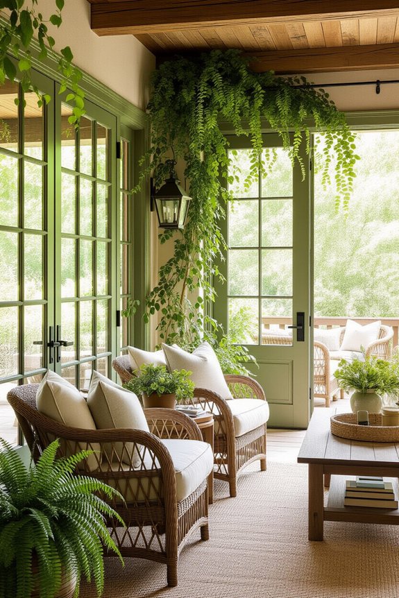
While you might think of your home as just a collection of rooms, blending indoor and outdoor spaces can make it feel more like a harmonious retreat. Start by choosing colors that connect both areas; for example, if your living room has soft greens, consider those same shades for outdoor cushions or planters. Next, use similar materials, like natural wood or stone, to tie everything together. This way, when you step outside, it feels like an extension of your cozy living space. Don’t forget lighting! String lights or lanterns can create a warm atmosphere. Imagine sipping your favorite drink while enjoying this seamless flow—sounds dreamy, right? Embrace this idea, and you’ll create a joyful, inviting space everyone will love!
Common Color Palette Mistakes to Avoid
Creating a beautiful color palette for your home can feel a bit like picking toppings for your favorite pizza—it’s all about balance! You want to avoid a few common mistakes that could leave your space feeling chaotic instead of cozy.
Here are three key pitfalls to dodge:
- Ignoring Lighting: Colors can look different in sunlight versus artificial light. Always consider how the light will affect your choices!
- Overusing One Color: Picking one color and using it everywhere can make your home feel flat. Mix things up with accents and complementary shades.
- Choosing Trendy Colors: Trends fade, but your home is forever! Pick colors that resonate with you, not just what’s popular.
With a little thought, you can create a space that truly feels like home!
Testing Paint Colors Before Committing
Before you plunge into painting your walls, it’s super important to test those colors. Imagine picking a shade that looks dreamy in the store but turns out to be a bit too wild once it’s on your walls. To avoid this, grab some sample pots and paint swatches on poster boards. Try them in different rooms, and don’t forget to observe how they change with the light throughout the day. You might find that a color you loved in the morning feels completely different at night! It’s like getting to know your colors before committing. Plus, this little experiment can be a fun family activity. So go ahead, release your inner artist, and make sure your home truly reflects your style!
Refreshing Your Color Palette With Seasonal Decor

Have you ever noticed how a simple change in decor can transform the vibe of your home? Revitalizing your color palette with seasonal decor is an easy way to keep things lively and fun! Here are three ideas to inspire you:
- Add Seasonal Accents: Swap out throw pillows or blankets. Think warm oranges and browns for fall, or bright pastels for spring!
- Change Artwork: Rotate your wall art to match the season. A winter landscape painting can bring a cozy feel, while summer florals brighten up the space.
- Use Natural Elements: Incorporate seasonal flowers or branches. They not only look beautiful but also bring fresh scents into your home.
These small changes can make a big difference, keeping your home feeling new and inviting year-round!
Incorporating Textures and Patterns With Your Colors
When you think about color in your home, don’t forget the magic that textures and patterns can bring! Mixing different textures—like soft pillows, sleek wood, or shiny metals—can make your color palette pop. Imagine a cozy, knitted throw on a bright sofa; it instantly adds warmth. Patterns, too, can create excitement! Think about adding a fun geometric rug or floral curtains to your space. Just make sure they complement your main colors. It’s like a dance party for your eyes! You want everything to flow together, so choose patterns that share similar hues. As you experiment, don’t be afraid to let your personality shine through. Your home should feel like you, bursting with vibrant colors and delightful textures!
The Role of Furniture and Accessories in Color Cohesion
Furniture and accessories are like the icing on the cake when it comes to creating a cohesive color palette in your home. They’re essential for tying everything together! Here are three key ways to use them effectively:
- Choose Complementary Colors: Pick furniture pieces that echo the shades in your walls or textiles. This creates harmony and balance.
- Mix Different Textures: Incorporate a variety of materials, like soft fabrics or shiny metals, to add depth while keeping your color scheme intact.
- Add Fun Accessories: Use pillows, rugs, or vases in your chosen palette. They can be playful, just like a splash of sprinkles on your cake!
With these tips, you’ll create a space that feels warm, inviting, and totally you!
Using Artwork and Decor to Reinforce Your Palette
Your home isn’t just about the furniture and accessories; it’s also a canvas waiting for your personal touch! Artwork and decor can tie your color palette together beautifully. Think about choosing pieces that reflect the colors you love. A vibrant painting with shades from your living room can create harmony and make your space feel connected.
Don’t forget about smaller decor items like cushions or vases! They can echo your palette, adding layers of color and texture. Mix and match frames for a gallery wall, keeping the colors consistent but the styles varied. This adds interest and personality. So, immerse yourself in your art collection and let your walls speak! After all, your home should feel like a warm hug.
Color Coordination Tips for Small Spaces
Ever wondered how to make a small space feel bigger and brighter? You can create a cozy atmosphere while maximizing your room’s potential with a few smart color choices! Here are three tips to get you started:
- Choose Light Colors: Soft hues like pastels or whites reflect light beautifully, making the room feel airy and open.
- Use Accent Walls: Paint one wall a bold color to add depth without overwhelming the space. It’s like giving your room a stylish hug!
- Limit Your Palette: Stick to a few colors throughout the room. This creates a cohesive look that ties everything together, making the space feel unified.
With these simple tips, you’ll turn your small space into a delightful retreat!
Maintaining Your Color Palette Over Time
Creating a beautiful home isn’t just about picking the right colors; it’s also about keeping that vibrant palette fresh and lively over time. To do this, regularly assess your space. Is there a room that feels a bit off? Maybe it needs a fresh coat of paint or a new accessory to brighten it up! You can also swap out smaller items, like cushions or artwork, to keep things feeling exciting. Don’t forget about lighting—it can change how colors appear dramatically. And if you ever feel stuck, grab a color wheel or consult a friend. Remember, your home should spark joy, not stress! So, embrace change and let your personality shine through your ever-evolving color choices!
Frequently Asked Questions
How Do I Choose a Color Palette for a Rental Home?
Start by considering your furniture and personal style. Choose a few complementary colors that evoke the mood you want. Test swatches, and remember to keep it versatile for future décor changes or landlord restrictions.
Can I Mix Different Styles With a Cohesive Color Palette?
Yes, you can mix different styles while maintaining a cohesive color palette. Just choose a few complementary colors and apply them consistently across your decor. This unifies varied styles, creating a harmonious and inviting space.
What Colors Increase Resale Value in a Home?
Neutral colors like soft grays, beiges, and whites often increase resale value. They create a fresh, inviting atmosphere, appealing to a wider range of buyers. Stick to these shades for a more marketable home.
How Do Cultural Influences Affect Color Choices?
Imagine a tapestry woven from diverse threads; cultural influences shape your color choices, reflecting traditions and emotions. You embrace vibrant reds for celebration or calming blues for tranquility, letting your surroundings tell a unique story.
What Tools Can Help Me Visualize My Color Palette?
You can use color palette generators, like Adobe Color or Coolors, to visualize your options. Paint samples and apps that simulate colors in your space also help you see how everything will come together beautifully.